Flatsome vs Porto Theme comparison [2026] 💥
FLATSOME vs PORTO
Porto vs Flatsome, both of these themes claim to be the cream of the crop for building web shops. I know the themes quite well and indeed that is their specialty. These are all-round themes that can actually be used for everything, so not just shops, corporate sites, blogs, et cetera. We take a closer look at the themes and see how big and where the differences between these two bestsellers are.
FLATSOME THEME (Porto vs Flatsome)
Alright, brace yourselves for a chuckle-worthy exploration of Wordpress themes! We're diving into the quirky world of themes that think they're the cat's pajamas of online shopping. Leading the pack is Flatsome. Oh, Flatsome, you show-off! We're putting this theme under our comedy microscope. Let's giggle our way through what the internet's finest keyboard warriors had to say about Flatsome.
Drumroll, please... They bagged a dazzling score from 5576 customers, boasting an average of 4.80 out of 5. That's not just high; it's sky-high! No wonder this theme has been flying off the digital shelves, with 206,754+ downloads and counting.
Advertisement
Let's time travel back to the end of 2013 when Flatsome made its grand entrance into the market. Now, hold your horses - we're not dealing with a greenhorn theme here. This is a seasoned veteran that's been flexing and refining its digital muscles for 7 years! That's right, seven whole years of squashing bugs and smoothing out the digital wrinkles. This theme is practically bug-proof by now. And guess what? It's not vanishing into the digital abyss anytime soon, so you can keep on enjoying its flawless charm for years to come.
Flatsome review: Woocommerce
So here's the scoop: Flatsome is like the superhero of e-commerce, joining forces with Woocommerce, the Robin to its Batman in the world of Wordpress shopping plugins. My detective work reveals that this theme is like a Swiss Army knife in the e-commerce jungle. You want variety? Flatsome's got it! Every product page can strut its own style, as shown below. And those checkout pages? Pimp them out with just a few clicks in the CMS - no coding, no sweat, no tears!
And the party doesn't stop there! Flatsome is like the ultimate Swiss Army knife of shop features. We're talking about a wishlist that's like your personal shopping genie, a sticky header that's always there for you, live product-search that's like having a psychic for your shopping needs, and unlimited forms for all your whimsical desires. The masterminds behind this theme had one goal: pack it with as much functionality as a superhero's utility belt, all while keeping it as easy to use as your favorite pair of comfy slippers.
Flatsome review: Headers
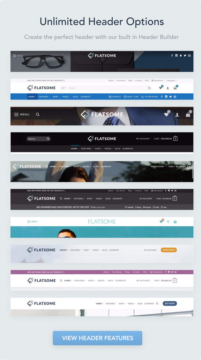
Now, let's put the spotlight on another dazzling feature that caught my eye during this Flatsome Wordpress theme review - the ease of tweaking the header. It's like having a magic wand for your website's forehead! But wait, there's more: the header builder is a real game-changer. Imagine crafting your dream header in just a few minutes, like a digital Picasso! It's like making a sandwich, but way cooler. Check out the two photos below for a peek into this wizardry.
Flatsome review: UX Builder
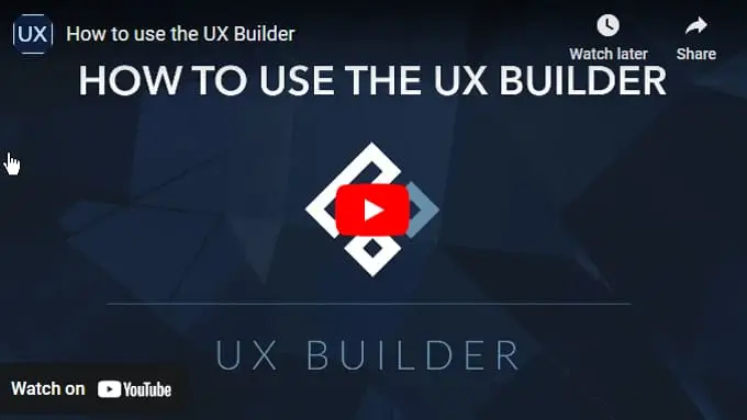
Just like Avada struts its Fusion Builder and Kallyas shows off its Zion Builder, Flatsome brings its own party trick with the UX Builder. It's like each theme has its own special dance move! These builders are the crème de la crème, tailor-made for their respective themes.
Sure, they might not have all the bells and whistles of the top page builders in the market, but they're still pretty nifty. Want a sneak peek? Check out the video below to see the UX Builder in action. It's only a 9-minute adventure into the land of easy-peasy page building!
Flatsome review: SEO
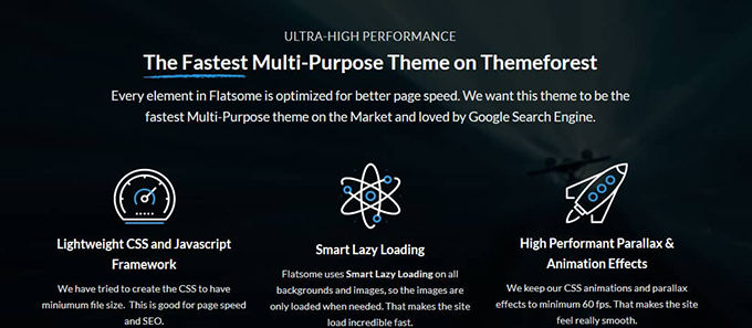
Let's switch gears and talk SEO in this Flatsome review. Get ready for a bold claim - Flatsome boasts it's the Usain Bolt of themes on Themeforest. Fastest ever? Well, that's a tough race with many sprinters at the starting line, but Flatsome definitely doesn't dawdle when it comes to loading time. Curious about who else is leading the pack in the WordPress speed Olympics? Check out my article on the topic for more lightning-fast theme action!
Flatsome review: Elements
Like a treasure chest of goodies, Flatsome is bursting with elements that you can sprinkle across your pages using their page builder. It's like having a buffet of digital delights at your fingertips! I won't bore you with a laundry list of these features. Instead, feast your eyes on the image below. It's like a picture book that tells the whole story - one glance and you'll be in the know!
Closing comment
But wait, there's more! Flatsome is like an iceberg of features, and what I've covered in this review is just the tip. If your curiosity is tickling you, why not dive into their own site for a full-blown exploration? Flatsome isn't just any theme; it's a top-tier choice, especially for crafting stellar shops. It's like investing in a magic wand for your website – totally worth the money. Plus, it comes with a cherry on top: fantastic documentation and support!
PORTO THEME (Porto vs Flatsome)
I will discuss here the Wordpress version of the Porto Theme. There is also an HTML 5 version that has been around much longer, that you can find here. But we will discuss that another time. The Porto Theme has risen sharply lately, although it has always been among the best themes.
Porto theme review: Rating
When we check out Porto's rating on Themeforest, it is indeed 4.92 out of 5. I know the site and all the themes very well there, and 4.92 may very well be the highest possible rating for the 20 best-selling themes. There are themes with a higher rating, but not on Themeforest. Porto has been sold over 78.767+ times and 2855 people have given a rating, so that is very reliable.
Porto theme review: Demos
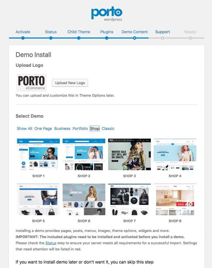
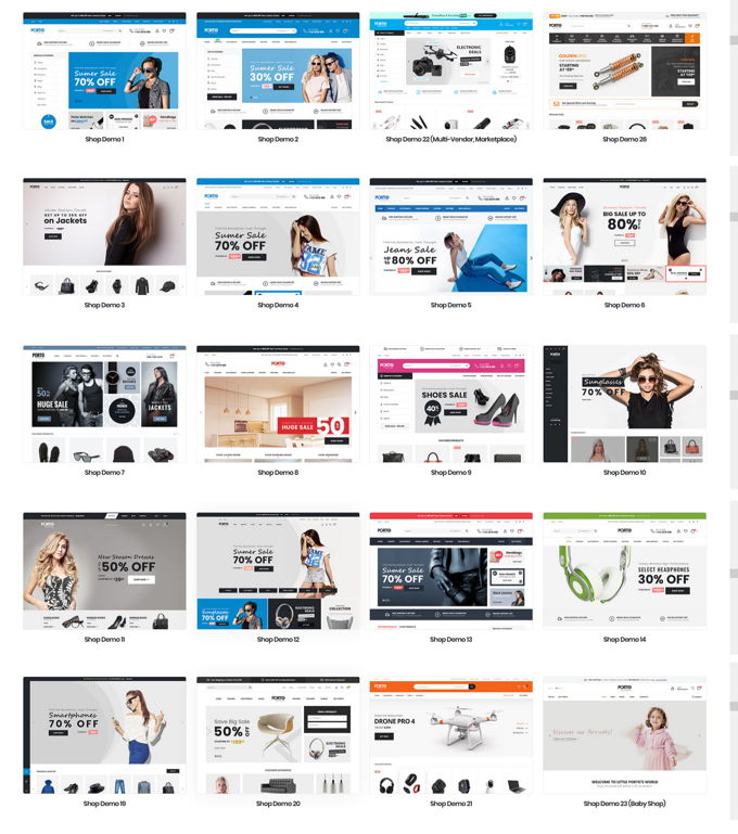
The theme has gone through some pretty extreme improvements that we're going to talk about now. Just like any other self-respecting WP theme nowadays, Porto has ready-made demo websites that can be installed with one click. They have added 30 of these since the last upgrade, bringing the total to almost 100.
The nice thing about demos is that you can make a quick start. The website is already with the wrong photos and texts in principle. So put your logo in it, adjust texts and photos and you are well on your way to having your own site.
Porto theme review: Webshops
66 multipurpose demos are available for all conceivable niches that can be used to create beautiful corporate and private websites. It is great that no fewer than 33 demos are ready-made shops. From here you can quickly start a webshop.
Porto theme review: Speed
In the meantime, no theme wants to be left behind in terms of loading times or speed, as Google attaches more and more value to this. Porto is therefore also built with a fast code that ensures good loading times in browsers. Porto also has a built-in speed wizard that helps you make your website even faster, which is quite unique. Of course you can also do this yourself if you read my tutorial here.
Porto theme review: Pagebuilders
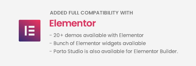
The Porto theme comes standard with the in my opinion very good WP Bakery Pagebuilder. A solid page builder that has several third-party plugins available to extend the elements. The theme is also fully compatible with the Elementor page builder, one of the best out there in this area. Among the demos you will find about twenty layouts that have been made with it, so that you can work with Elementor after you install one.
Click on the video above to see the page builder in action.
Porto theme review: Header builder
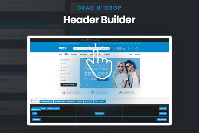
The header is like a grid where you can drag and drop elements. So it is easy even for laymen to build exactly the header they had in mind. A cool tool! We can't help but give the full marks for this in this Porto theme review.
Porto theme review: Elements
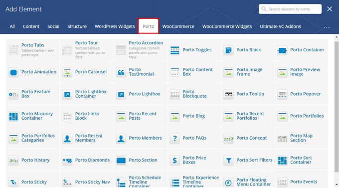
Porto currently offers 33 elements for the Bakery Pagebuilder, which, as mentioned before, is easy to expand with plugins.
Porto theme review: Revolution Slider
The Revolution Slider is by far the best slider plugin. There are a lot of options, which takes some getting used to if you do not know the plug-in yet and also after a major upgrade as has only happened with the new version 6. However, the documentation of the plug-in is very good, which means that you will quickly discover how everything works. Google searches also always help me with that. The good side is that once you get used to it, you don't want anything else. There are practically no limits to what it can do and everything works smoothly.
Porto theme review: Conclusion
I think the Porto theme is great. The demo layouts are beautiful, the setup of the theme is quick and easy, and it has a good loading time. The theme is indeed very suitable for building shops and the header builder is of course fantastic. The price is just standard for themes on Themeforest so that's okay too. The theme offers great value for money.
Porto vs Flatsome conclusion
First of all, thank you for reading this Porto vs Flatsome comparison to the end. Both themes have impressive heder builders and good page builders. Flatsome uses its own UX-Builder, Porto uses Elementor Free but with an extra widget. Both themes have very professional web shops built and as far as I am concerned these 2 themes are completely equivalent. Regardless of which theme, it is always a good choice if you are looking for a theme for only 1 website.
In case you want to provide 2 or more websites with a theme, I do not recommend both of these themes because then it will be much too expensive, since a separate expensive license will be required for each website. In that case, you can much better use Astra or Divi as it will save you money for multiple sites. In addition, these latter themes are ranked higher in my top 10 themes for [2026] than Flatsome and Porto.
Advertisement
![Flatsome Theme review [2026] Flatsome Wordpress Theme review](images/images-blog/flatsome-theme-review.jpg)


