Flatsome vs Be-Theme theme-comparison [02-2026] 💥
FLATSOME vs BE-THEME
The Be-Theme vs Flatsome, these are 2 themes that can be found in the top for best-selling Wordpress themes on the well-known Themeforest marketplace. I know both themes quite well and have made a number of sites with them. These are both very good themes that can be used for any kind of website. Let's take a look at how the themes relate to each other.
FLATSOME THEME (Be-Theme vs Flatsome)
Alright, brace yourselves for a chuckle-worthy exploration of Wordpress themes! We're diving into the quirky world of themes that think they're the cat's pajamas of online shopping. Leading the pack is Flatsome. Oh, Flatsome, you show-off! We're putting this theme under our comedy microscope. Let's giggle our way through what the internet's finest keyboard warriors had to say about Flatsome.
Drumroll, please... They bagged a dazzling score from 5576 customers, boasting an average of 4.80 out of 5. That's not just high; it's sky-high! No wonder this theme has been flying off the digital shelves, with 206,754+ downloads and counting.
Advertisement
Let's time travel back to the end of 2013 when Flatsome made its grand entrance into the market. Now, hold your horses - we're not dealing with a greenhorn theme here. This is a seasoned veteran that's been flexing and refining its digital muscles for 7 years! That's right, seven whole years of squashing bugs and smoothing out the digital wrinkles. This theme is practically bug-proof by now. And guess what? It's not vanishing into the digital abyss anytime soon, so you can keep on enjoying its flawless charm for years to come.
Flatsome review: Woocommerce
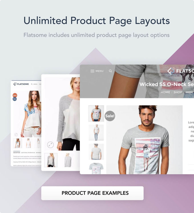
So here's the scoop: Flatsome is like the superhero of e-commerce, joining forces with Woocommerce, the Robin to its Batman in the world of Wordpress shopping plugins. My detective work reveals that this theme is like a Swiss Army knife in the e-commerce jungle. You want variety? Flatsome's got it! Every product page can strut its own style, as shown below. And those checkout pages? Pimp them out with just a few clicks in the CMS - no coding, no sweat, no tears!
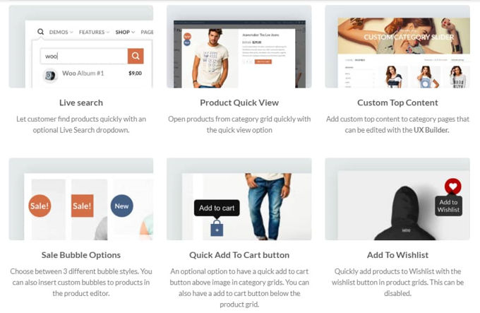
And the party doesn't stop there! Flatsome is like the ultimate Swiss Army knife of shop features. We're talking about a wishlist that's like your personal shopping genie, a sticky header that's always there for you, live product-search that's like having a psychic for your shopping needs, and unlimited forms for all your whimsical desires. The masterminds behind this theme had one goal: pack it with as much functionality as a superhero's utility belt, all while keeping it as easy to use as your favorite pair of comfy slippers.
Flatsome review: Headers
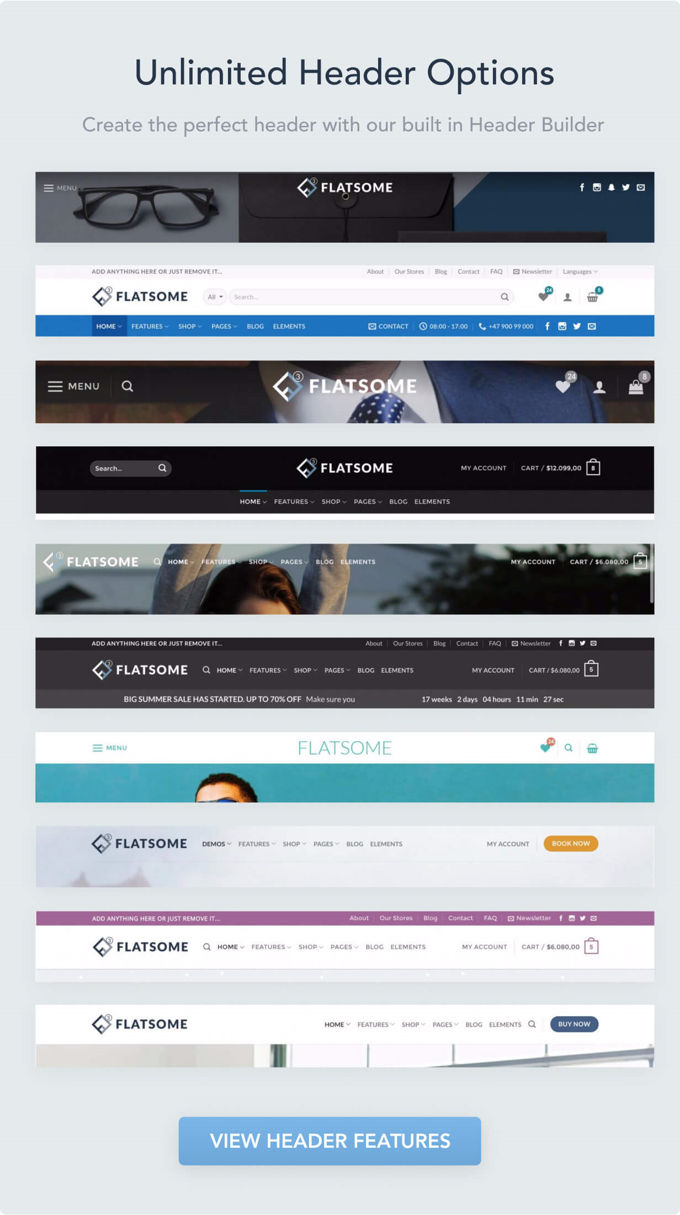
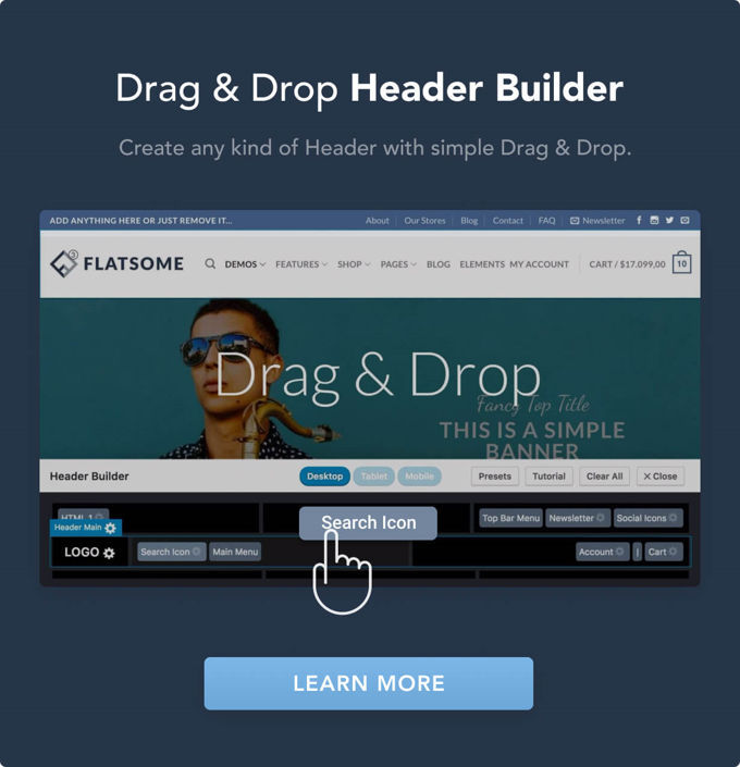
Now, let's put the spotlight on another dazzling feature that caught my eye during this Flatsome Wordpress theme review - the ease of tweaking the header. It's like having a magic wand for your website's forehead! But wait, there's more: the header builder is a real game-changer. Imagine crafting your dream header in just a few minutes, like a digital Picasso! It's like making a sandwich, but way cooler. Check out the two photos below for a peek into this wizardry.
Flatsome review: UX Builder
Just like Avada struts its Fusion Builder and Kallyas shows off its Zion Builder, Flatsome brings its own party trick with the UX Builder. It's like each theme has its own special dance move! These builders are the crème de la crème, tailor-made for their respective themes.
Sure, they might not have all the bells and whistles of the top page builders in the market, but they're still pretty nifty. Want a sneak peek? Check out the video below to see the UX Builder in action. It's only a 9-minute adventure into the land of easy-peasy page building!
Flatsome review: SEO
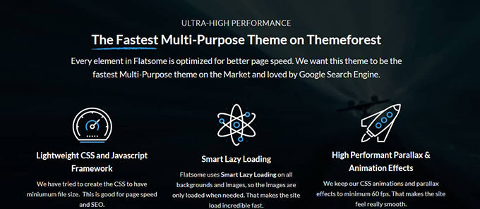
Let's switch gears and talk SEO in this Flatsome review. Get ready for a bold claim - Flatsome boasts it's the Usain Bolt of themes on Themeforest. Fastest ever? Well, that's a tough race with many sprinters at the starting line, but Flatsome definitely doesn't dawdle when it comes to loading time. Curious about who else is leading the pack in the WordPress speed Olympics? Check out my article on the topic for more lightning-fast theme action!
Flatsome review: Elements
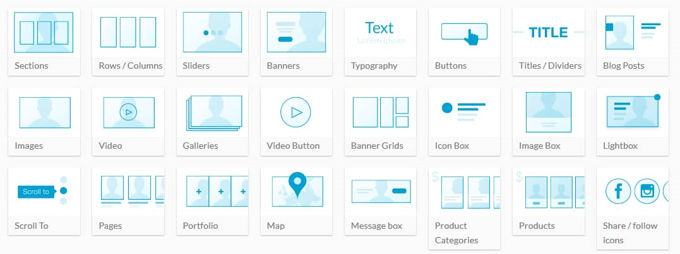
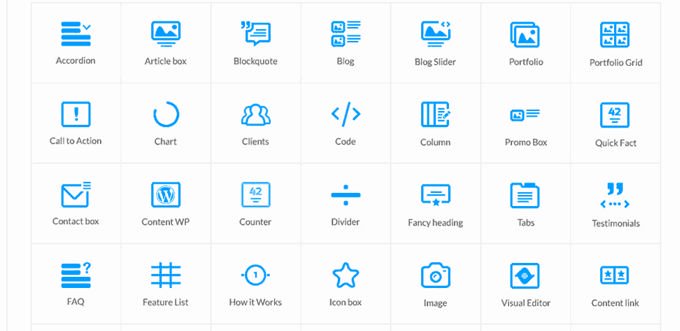
Like a treasure chest of goodies, Flatsome is bursting with elements that you can sprinkle across your pages using their page builder. It's like having a buffet of digital delights at your fingertips! I won't bore you with a laundry list of these features. Instead, feast your eyes on the image below. It's like a picture book that tells the whole story - one glance and you'll be in the know!
Closing comment
But wait, there's more! Flatsome is like an iceberg of features, and what I've covered in this review is just the tip. If your curiosity is tickling you, why not dive into their own site for a full-blown exploration? Flatsome isn't just any theme; it's a top-tier choice, especially for crafting stellar shops. It's like investing in a magic wand for your website – totally worth the money. Plus, it comes with a cherry on top: fantastic documentation and support!
BE-THEME THEME (Be-Theme vs Flatsome)
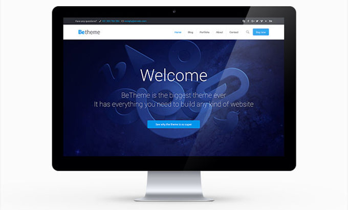
In this Be Theme review, we're diving into the good, the bad, and the stylish of this fabulous theme. First thing you'll notice? Its design is like the little black dress of themes – simple yet oh-so-chic. Once you start tinkering with it, you'll find that tweaking this theme is easier than teaching a cat to nap. It's that user-friendly! Stay tuned as we unpack the cornucopia of features this theme has tucked under its elegant sleeve in the rest of this review.
Be Theme review lay-out
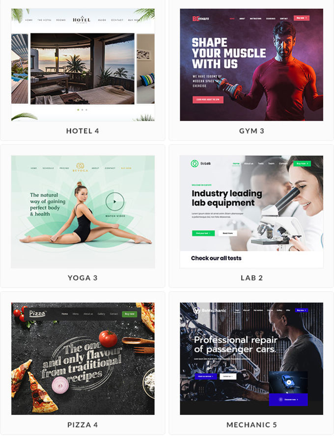
The Be Theme is like a digital buffet with an all-you-can-eat offer of 600+ different demo websites, all installable with just one click. It's like having a wardrobe with an outfit for every occasion – you'll find several fitting themes for each niche to kick-start your own digital fashion show. As a web designer, it's like having a secret treasure chest; I can always find the perfect layout for client websites faster than a magician pulling a rabbit out of a hat!
A few demo-examples
Let's keep it real: the Be Theme is like the perfect buddy for creating a cool, functional site. But, if you're aiming to craft a website that's the digital equivalent of a Hollywood blockbuster, with all the glitz and glamour, you might want to explore other premium theme stars. For reviews of those red-carpet-ready themes, check out our overview of top themes for [2026]. Think of the Be Theme as the friendly neighborhood hero, perfect for beginners and those looking to make a solid, good-looking website without the complexity of a blockbuster production.
The mastermind behind the BeTheme is Muffingroup, an elite seller on Themeforest, strutting their stuff with around 15 products, mostly themes. Muffingroup has racked up accolades like 'recommended author', 'monthly bestseller', 'power elite author', and 'weekly bestseller'. It's like they're the rock stars of the theme world! With an average rating of 4.62, which is like getting a standing ovation in the theme community, the Be Theme has been the star of the show, with 267,893+ sales since 2014.
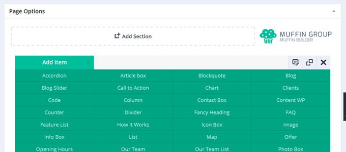
Muffin Builder, a drag & drop pagebuilder
The Be Theme comes with its own backstage crew, the Muffin Builder, to quickly zhuzh up your site. This drag & drop page builder is more than just satisfactory – it's like having a magic wand for your website. With all the necessary options and the choice of 600+ layouts, adding items to your pages is as easy and fun as playing with LEGO bricks – but with more impressive results!
Be Theme review: WP Bakery Pagebuilder
If you're not a big fan of the Muffin Builder, don't fret – the Be Theme also rolls out the red carpet for the WP Bakery pagebuilder. This page builder is like the Hollywood celebrity of page builders, famous for its versatility and ease of use. Imagine having the option to choose between a cozy coffee shop (Muffin Builder) and a fancy café (WP Bakery) – both serve great coffee, but the ambiance is just a tad different.
WP Bakery also uses a drag & drop system and is a fantastic tool for creating stunning pages with artistic freedom. To buy it separately would cost you a pretty penny – $64, to be exact. Personally, it's one of my favorite page builders, as it struts its stuff in practically all the top themes and comes with a plethora of add-ons. It's like the Swiss Army knife in the world of page builders!
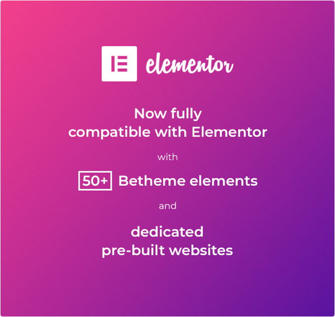
New: Elementor compatibility
Since [2026], the BeTheme has also been equipped with Elementor, and with quite a few extra widgets as shown below.
Video and Parallax Backgrounds
The BeTheme is like a magician with its parallax backgrounds, creating an enchanting experience for your site's audience. Imagine your website as a stage, where full-width and video backgrounds are the spotlight that adds drama and flair. With a well-styled page, your site can don a tuxedo and look as professional as a James Bond movie. During the writing of this BeTheme review, it's clear that this quality really makes the theme stand out in the crowd.
20+ Different Header Styles
The Be Theme brings more versatility to the table than a chameleon at a color festival. With over 20 standard header styles, it's like having a wardrobe full of hats – there's one for every occasion. The logo and menu aren't just stuck at the top; they're free to roam left or right, giving you the creative freedom of a jazz musician. The customization doesn’t stop there; fonts, sizes, colors - it's all malleable. The Be Theme even lets you mix and match headers and logos on different pages, like a DJ mixing tracks.
Shortcode Generator
Imagine having a magic wand for your website – that's the shortcode generator in the Be Theme. It can conjure up a shortcode for practically every function in the theme. You can sprinkle these magical codes across pages, posts, or widgets, integrating features with the ease of a fairy godmother waving her wand.
BeTheme Extras
The Be Theme is like a Swiss Army knife for your website, packed with features. Picture this: 600+ different fonts (that's more fonts than a typographer’s dream), custom Widgets for every nook and cranny of your site, and the Revolution Slider, which is like the roller coaster of sliders – thrilling and dynamic. WooCommerce Ready?
Check. It's like setting up shop in the busiest digital marketplace. Got content in a different language? No problemo, RTL support has got your back. The Mega Menu is like an all-you-can-eat buffet for your navigation needs, and the visual icon selector is like picking candy from a candy store.
Unlimited sidebars? It's like having infinite shelves for all your goodies. And let’s not forget the cherry on top: Bonus Premium Plug-ins, a maintenance mode that's as sleek as a 'We'll be back soon' sign, Google Maps Styles that dress up your location pins, and BuddyPress Ready for social butterflies. Plus, styles for ContactForm7 and Gravity Forms, making forms feel like a walk in the park. It's like having a digital tool belt with all the fanciest gadgets.
Compatible with WPML
Be-Theme vs Flatsome conclusion
First of all, thank you for reading this Be-Theme vs Flatsome comparison to the end. The Be-Theme recently comes with Elementor and 50 extra Elementor widgets. Flatsome's UX-Builder or Elementor with 50 extra widgets, that's a tough choice. Of course you can always upgrade to Elementor Pro which works much better than the UX-Builder. I think of the BeTheme a bit that the designs are made of low quality. Nice to be able to offer so many demos, but it comes at the expense of quality. Flatsome on the other hand has really beautiful designs, especially for web shops. I prefer Flatsome 100% for creating a webshop.
I have to say one thing and that is that the themes are very well put together, but as soon as one is looking for a theme for multiple sites, you will end up too expensive with these themes. A separate license is required for each website you want to create with it. The costs for 2 websites are already 120 dollars and you only have six months of support. For $ 89 you have the Divi Theme for as many sites as you want with one year of support, no comparison. I would say that there is no better theme than the Divi Theme.
Advertisement
![Flatsome Theme review [2026] Flatsome Wordpress Theme review](images/images-blog/flatsome-theme-review.jpg)

