Botiga Theme Review for [2026] 💥
Botiga is a brand new minimalist Woocommerce theme...
In this Botiga Theme review, we take a look at the most important features of this theme which was made by aThemes, a professional company that offers some very good Wordpress themes via their website. In 2013, Charlie Livingston started aThemes as a one man company but nowadays they work with 6 programmers.
Advertisement
BOTIGA RATING
The theme has only just been released but has already been installed on 2.000+ websites and if we click on Wordpress.org Checking Botiga's rating, we see that all raters gave 5 stars. The theme is already a success and will be further developed with several demos and there will be a pro version later I assume.
BOTIGA LAY-OUT
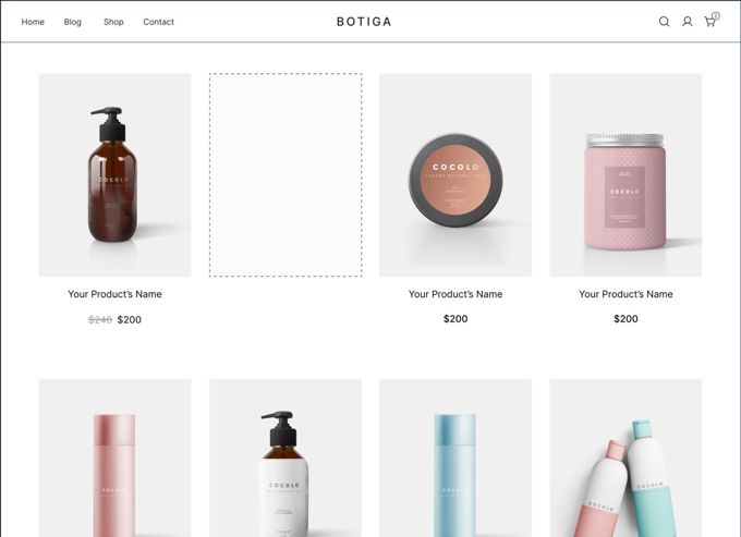
The Botiga theme has quickly become popular with many people because the theme has a simple but beautiful layout for a shop. Nowadays there is no need to worry about bells and whistles, simplicity can be very graceful. Botiga is a good example of this. The advantage of this is that you don't have to make a lot of adjustments to build a webshop with it, so you can finish your project in no time.
DIFFERENT CHECK-OUT STYLES
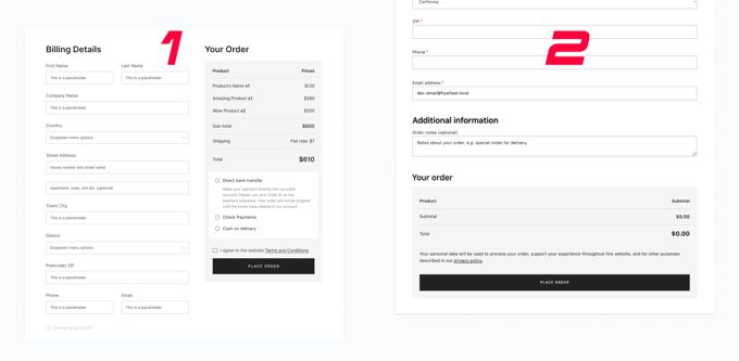
Not an important thing but you can choose whether you want to display the checkout in 1 or 2 columns. There are many more cart and checkout options but I try to keep this article interesting, you can check out the rest on their own site if your interest in Botiga has been sparked.
BOTIGA THEME REVIEW: SPEED
The Botiga theme is a fast loading theme although it is not in my list for fastest WP-themes. The theme itself without additional plugins with just a well-configured cache plugin produced the result presented above. Check out a demo of Botiga itself and see how fast it loads. Of course you can optimize your website yourself on loading time. Follow this tutorial here.
BOTIGA'S EDITOR
The Botiga theme uses the Gutenberg Editor by default, which is certainly not my favorite editor. But since this is a shop and most of the work is done in Woocommerce, it doesn't matter much. Tip: To make Gutenberg work a lot better and make it look more like a page builder, it's a good idea to use the CoBlocks plugin from Godaddy.
BOTIGA: PRODUCTS LAY-OUT
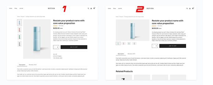
Even though I only show 2 above, you can choose from 3 different layouts for the product pages. If you want complete control over the Woocommerce layouts you will need to use a theme like Divi. Three layout is just standard for a good theme.
BOTIGA: COLOR PALETTE
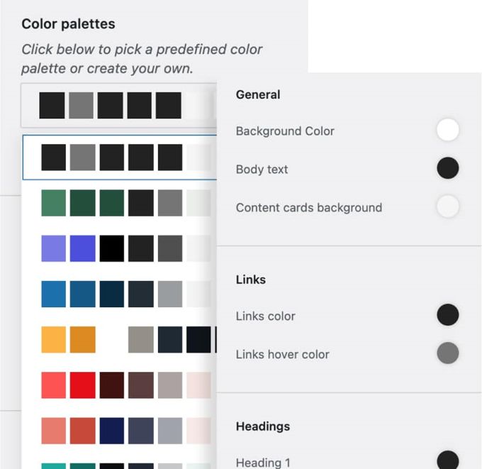
There are quite a few standard color combinations that can be set with a single click, additional personal adjustments can be made afterwards. These are standard options for most themes, but it is well put together at Botiga.
BOTIGA: BLOG

I see they have paid a lot of attention to their blog, because 6 different layouts is a big variation. I don't think the theme is suitable as a pure blog, because then there should be homepages available that are set up for a blog website, but this is more than enough as support for a webshop.
BOTIGA THEME REVIEW: CONCLUSION
Thank you for reading my Botiga theme review for [2026] to the end. Botiga is a new fresh theme, very suitable to quickly create a build a good shop. The theme builder aThemes always does a good job and in my opinion this theme has a great future. If you want options and frills in your webshop with a real page builder, see if WP-Astra might be something for you. Want even more options and frills? Then choose the Divi Theme.
Advertisement


