Twenty Twenty-Two vs Twenty Twenty-One 💥
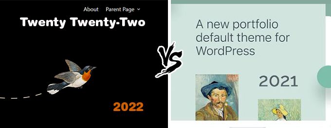
TWENTY-TWENTY-TWO (2022 vs 2021)
Twenty Twenty-Two is the default WP-theme for the year 2022...
WordPress 6.6.1 introduces its first "Block Theme" named Twenty Twenty-Two with Full-Site Editing (FSE). This new WordPress theme uses blocks to create all areas of your website, including your header, navigation area and footer. The new Site Editor allows you to create and edit blocks and provides additional control for styling and typography. To give you complete control over the design of your website, a new template system was introduced.
Advertisement
TWENTY TWENTY-TWO THEME RATING
One would almost feel sorry for the Wordpress developpers as they try really hard and come up with new stuff but their themes get very bad ratings. Have a look at the image below and see how almost the same amount of people score it 1 or 2 stars as 5 stars. In total giving it an average rating of 3.4 which is just extremely bad.
HOW START WITH THE TWENTY TWENTY-TWO THEME?
Well, if you have WordPress 6.6.1 on your website then you also have this new theme. Just go to the theme section and activate it. The theme has already built up 200,000+ active installations within a few months. Quite logical, since the theme is already in Wordpress, it is of course widely used. Also because people are curious about it.
TWENTY TWENTY-TWO SITE EDITOR
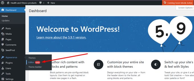
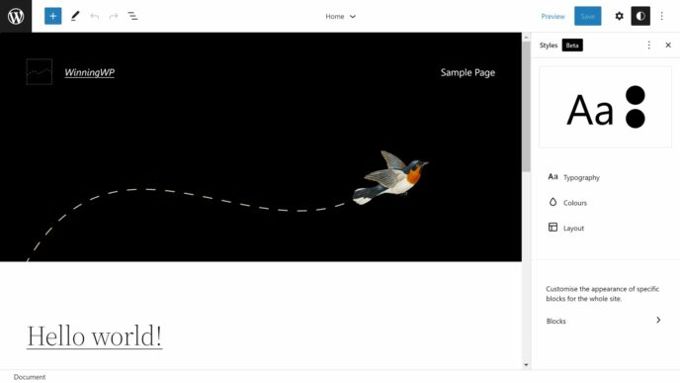
The new Site Editor is used instead of the WordPress theme customizer for block themes like Twenty Twenty-Two. This menu can be accessed via the WordPress appearance menu. The WordPress theme customizer may still be used whenever a theme requiers it.
TWENTY TWENTY-TWO TYPOGRAPHY
Twenty Twenty-Two uses Source Serif Pro font to create its headings. It is paired with a simple and easy-to-read sans-serif font. Sans Serif Fonts are amongst the Graphic Design Trends for [2026]. The following font sizes are available in the editor for the Twenty Twenty-Two theme: 16px, 18px, 20px, 24px, 40px, 96px, 144px.
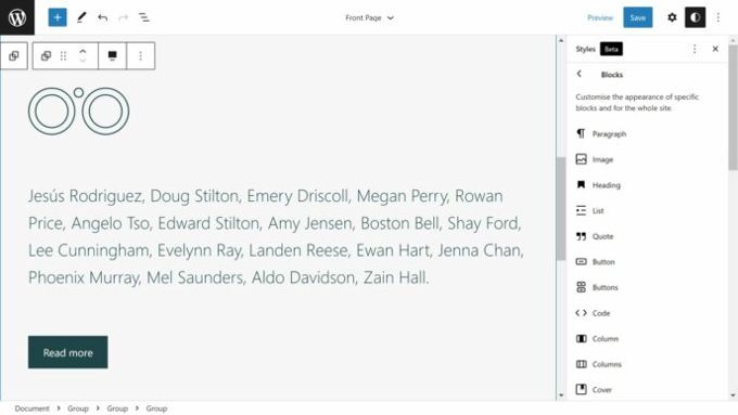
2022 REVIEW: BLOCK STYLING
The Site Editor allows you to customize the styling of specific blocks on your website. This is a great improvement that website owners will appreciate. Styling is all very basic though, don't expect to much of it.
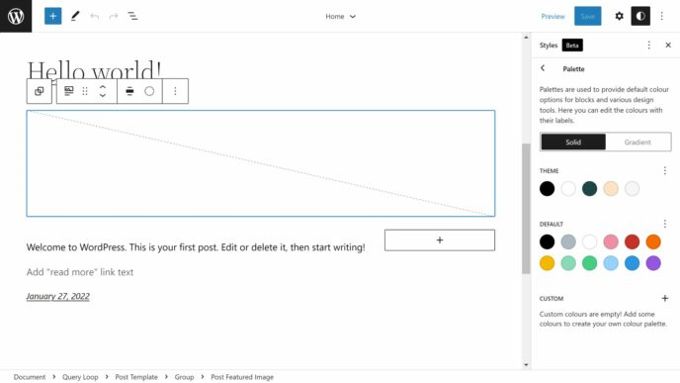
2022 REVIEW: COLORS
You can set the default colors for your theme as well as global elements like text, links and background. You can also configure solid colors and gradients. There is no advanced color editor like the ones we find in Photoshop or great themes as Divi or Astra. To be honest it is very basic just like the Block Styling.
TWENTY TWENTY-TWO TEMPLATES
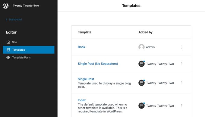
WordPress now has its own template system, and it's integrated directly into the Site Editor. All layouts can be accessed from the pages that contain templates and parts of them.
- Templates This displays page templates like your home page, blog index, search results pages, and archives page.
- Template parts - This shows you template parts like your header or footer
What Wordpress actually does here is imitate all the top page builders and themes that offer hundreds of templates The 11 templates such as searchpage, archive, single post, etc. all represent very little in terms of design. Templates can now also be saved and reused on multiple pages. If these are adjusted by you, that will immediately change on all these pages. This is also something that page builders like Divi and Elementor have been offering for years, and they have a much clearer and better system for it.
TWENTY TWENTY-TWO: THEME BLOCKS
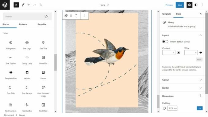
The Block Inserter is the large plus (+) symbol in the top right of the Site Editor or Block Editor. It breaks down blocks into categories like text, media, design, and widgets. WordPress 6.6.1 introduces a new category, theme. It lists 23 blocks that can be used to create your website design. Only 20 of them can be used in the Block Editor.
These are the theme blocks
- Navigation, Site Logo Site Title Site Tagline Query Loop Posts List
- Template Part, Header and Footer, Post Title, Excerpt, or Featured Image
- Post Content, Author, Post Date. Post Categories. Post Tags.
- Next Post, Previous Article, Post Comments Log In/Out, Term Description and Archive Title
2022 REVIEW: PATTERNS
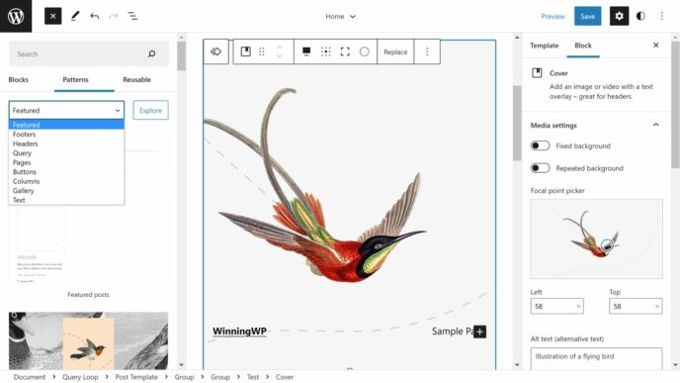
Pre-made blocks can be added to your WordPress website by clicking a button. These patterns are also called Block Patterns. These patterns were introduced to the WordPress 5.8 Block Editor, but WordPress themes still used the WordPress theme customizer at the time so there wasn't any need for WordPress themes that supported patterns.
Because of its integration with the Site Editor, patterns will be an integral part of block themes like Twenty Twenty-Two. Twenty Twenty-Two has a wide range of patterns to help you design your website. You can choose from unique patterns for your header and footer as well as blog posts. Sounds all very nice but these are things that were invented 15 years ago of course.
TWENTY TWENTY-TWO REVIEW CONCLUSION
It is not entirely clear to me why Wordpress is doing its best with its new versions and new themes to reinvent the wheel. Both the disgustingly bad Gutenberg editor and the new templates are useless because all the top page builders do a much better job on this one. Well, Gutenberg costs nothing, but Elementor also has a free version that is 20x better than Gutenberg so why not just install that instead of tinkering with all the outdated stuff Wordpress itself is trying to offer?
TWENTY TWENTY-ONE (2021 vs 2022)
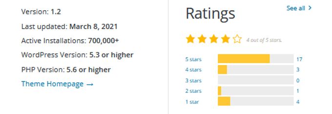
In this Twenty Twenty-One theme review we look at whether this is worth using in our websites. From Wordpress 5.6 this is the standard theme for Wordpress and it is currently active on 700,000+ websites. A fairly high number, so we cannot avoid reviewing this theme.
TWENTY TWENTY-ONE THEME FACTS
This theme did not originate from scratch but originated from the not too well known Seedlet Theme. If we take a look at the rating of Twenty Twenty-One below, then we sense that there were also some people who gave 1 point out of 5. Despite the fact that Twenty Twenty-One is very well put together, it is a so-called minimalist theme that just doesn't do much with it. It serves as a flawless but simple basis for the block editor. The theme has maximum accessibility and meets the guidelines of WCAG 2.1 level AAA.
TWENTY TWENTY-ONE STRUCTURE
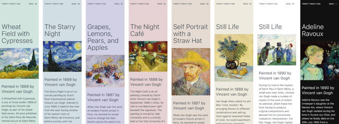
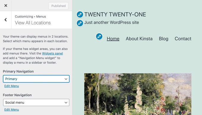
Twenty Twenty-One offers only 2 locations for menus, the main menu at the top and a footer menu. It offers a range of soft pastels as shown in the image below, in line with 2021 fashion, and it works with system fonts which provides performance benefits as no additional fonts need to be loaded.
TWENTY TWENTY-ONE FUNCTIONS
Twenty Twenty-One has the following theme features: Title tag, auto RSS, Thumbnails, Article formats, Custom background, custom logo, 2 navigation menus and 1 sidebar, HTML5 elements, and refresh for widgets. If you enter links to your social sites in the footer, the relevant icons will automatically be added.
Twenty Twenty-One has the following block features: Editor Styles, Wide Alignment, Standard Block Styles, Dark Editor Style, Block Color Palettes, Block Font and Sizes, Custom Line Height, Responsive Embeds, Block Color Gradient Presets, Start Content, Link Color, and Custom Spacing .
TWENTY TWENTY-ONE FONT-SIZES
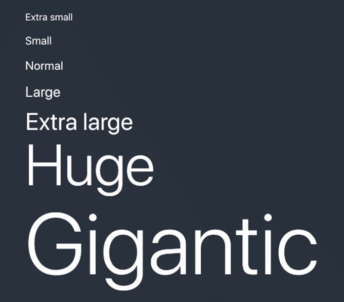
Twenty Twenty-One requires the Gutenberg editor for support. The following font sizes are available in the editor for the Twenty Twenty-One theme: 16px, 18px, 20px, 24px, 40px, 96px, 144px.
TWENTY TWENTY-ONE THEME REVIEW: COLORS
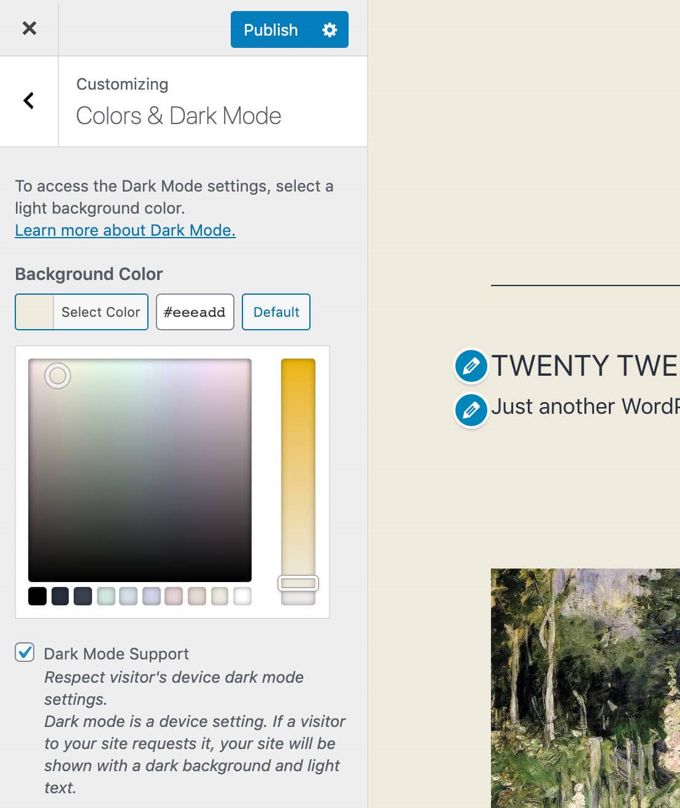
In the "Colors & Dark Mode" section of the Customizer you will find a simple color picker with 10 standard color palettes. Dark Mode can be turned on or off, giving your visitors the option to switch to Dark Mode.
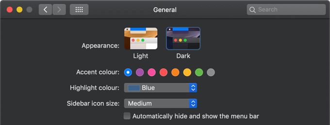
TWENTY TWENTY-ONE THEME REVIEW: DARK MODE
In the beginning there was talk that the Dark Mode option would become available as a separate plug-in, but at the last moment it was decided to integrate Dark Mode into the theme itself. The Dark Mode for Twenty Twenty-One was developed by Mel Choyce-Dwan. If you would like to use Dark Mode, check your site to see if logos and transparent images are still visible in this mode, because problems often occur there.
TWENTY TWENTY-ONE PAGEBUILDER
I am slowly going to tell you the truth about this theme and all other standard Wordpress themes. They all need the Gutenberg page builder which is just a very bad page builder, which is actually not ready to use yet, but Wordpress users are used as test persons, so to speak . If you want to work comfortably, it is best to install Elementor Free.
Now let's go one step further, because once you get started with Elementor, it makes a lot more sense to work with Elementor's free support theme: Hello Elementor. This just makes the standard Wordpress themes completely unnecessary. Another great option is to take Elementor with the supporting theme Astra Free, this greatly increases your options. Astra is one of the best themes out there.
Obviously if you are willing to spend some money you can Elementor Pro and Astra Pro should use. This will make your job a real pleasure because then you will be working with the best stuff there is.
2022 vs 2021 conclusion
First of all, thank you for reading this 2022 vs 2021 comparison to the end. If we compare the 2 themes, Twenty-Twenty-Two has more to offer but is a lot less popular then Twenty-Twenty-One. Wordpress is improving there default theme every year but it makes no sense as they are still years behind the real good themes and will always be. Sorry to say but both themes are only used because they come with Wordpress but are best ignored and immediately replaced with a decent free theme as I indicated above or by a good premium theme.
Advertisement
![Twenty Twenty-Two Theme review [2026] Twenty Twenty-Two Theme review](images/images-blog/twenty-twenty-two-theme-review.jpg)


![Twenty Twenty-One Theme review [2026] Twenty Twenty-One Theme review](images/images-blog/twenty-twenty-one-theme-review.jpg)
