Bridge vs Porto comparison [2026] 💥
Advertisement
BRIDGE vs PORTO
Porto vs Bridge, two very popular themes for some years now. Porto once started with an HTML version that is still very popular today, but we are talking about the Wordpress version here. We investigate the strengths and weaknesses of these themes.
BRIDGE THEME (Porto vs Bridge)
Bridge is one of the most successful themes on Themeforest. It has had a solid place in the top 10 since its first release in 2014. In total, it has now been sold 192.933+ times for a price of $ 59. The theme's rating is 4.78 out of 5 and there were 6,053 paying customers who gave it a rating. That is a very high rating, although there are also themes such as Astra that score 4.99. The Astra theme is not on Themeforest I have to say.
That high rating is due to an excellent support department, the beautiful and quick to install demos, the 2 page builders including Elementor since the last upgrade and the theme just looks very good on all different devices. Overall a top theme with many more qualities that we will now discuss individually.
Bridge review (Premium WP-Theme)
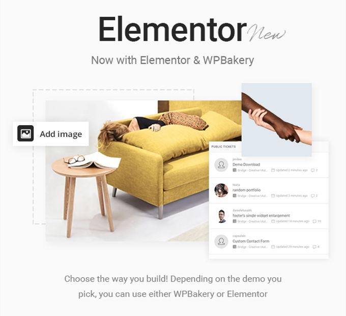
As mentioned, Bridge has more than a good rating, for example the two page builders it offers and not the least there are. The best is the Elementor page builder that appears more and more often in the top themes as is the case here. This page builder's premium version costs $ 99 a year, but you get it for free in Bridge (free version). In addition, the WP Bakery Pagebuilder also costs about $ 60 Themeforest (one-off plus six months support).
Bridge Demos
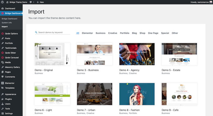
As shown below, Bridge has very nice demos in its library of no less than 480 copies. It is sometimes confusing with demos because some themes talk about separate pages, others about complete demo sites. The latter is the case here and that is really a lot.
One does not have to be an expert to be able to start his new website with one of these demos. In the wide choice of demo websites that Bridge offers, has layouts for every niche imaginable.
All these layouts are made with the page builders and with this you can also quickly adapt them to your own house style and content. If you still can't figure it out, you can always consult the extensive collection of video tutorials on their Youtube channel.
Bridge Woocommerce webshops
Like all themes in the top 20 and more, Bridge is built on a perfect collaboration with Woocommerce. That is the Wordpress webshop plug-in that practically everyone uses and I have been doing the same for years. There is nothing better. The theme offers various nice extras for the shops, such as quick view and wish list. If you are going to build a shop I would rather choose OceanWP or Astra which offer many more features.
Bridge Portfolios and Blogs
Regarding portfolios, you can choose from 7 different list layouts and 7 single layouts. The portfolios come with hover animations and you can determine the number of columns yourself. All this together is more than above average when it comes to portfolios. Bridge also does not come up short in terms of choice of blog layouts. Beautiful masonry layouts and vertical loop layouts.
Other nice features that the theme offers are: choice of 600+ Google fonts, 80+ shortcodes, translation ready with complete RTL support, testimonials, sticky header, call-2-action buttons, CSS 3 animations, Ajax page transitions, infographics and counters , Font Awesome and Font Elegant icon packs and social buttons.
Bridge Theme review conclusion
You have come to the end of my Bridge Theme review. It has become clear that the Bridge theme can be used for all types of websites and is also extremely suitable for shops. The theme looks very good on all possible devices and working with the theme is pleasant and simple, especially with Elementor. There are practically no weaknesses and the theme is well worth the $ 59 requested.
PORTO THEME (Porto vs Bridge)
I will discuss here the Wordpress version of the Porto Theme. There is also an HTML 5 version that has been around much longer, that you can find here. But we will discuss that another time. The Porto Theme has risen sharply lately, although it has always been among the best themes.
Porto theme review: Rating
When we check out Porto's rating on Themeforest, it is indeed 4.92 out of 5. I know the site and all the themes very well there, and 4.92 may very well be the highest possible rating for the 20 best-selling themes. There are themes with a higher rating, but not on Themeforest. Porto has been sold over 78.767+ times and 2855 people have given a rating, so that is very reliable.
Porto theme review: Demos
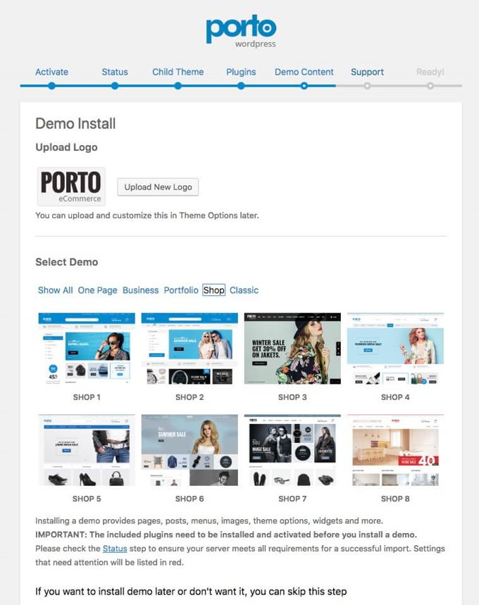
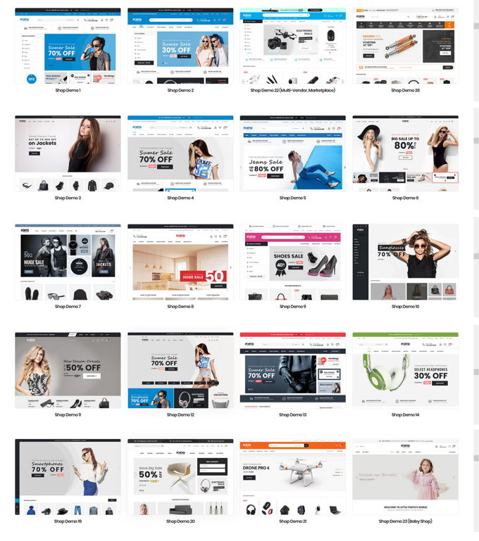
The theme has gone through some pretty extreme improvements that we're going to talk about now. Just like any other self-respecting WP theme nowadays, Porto has ready-made demo websites that can be installed with one click. They have added 30 of these since the last upgrade, bringing the total to almost 100.
The nice thing about demos is that you can make a quick start. The website is already with the wrong photos and texts in principle. So put your logo in it, adjust texts and photos and you are well on your way to having your own site.
Porto theme review: Webshops
66 multipurpose demos are available for all conceivable niches that can be used to create beautiful corporate and private websites. It is great that no fewer than 33 demos are ready-made shops. From here you can quickly start a webshop.
Porto theme review: Speed
In the meantime, no theme wants to be left behind in terms of loading times or speed, as Google attaches more and more value to this. Porto is therefore also built with a fast code that ensures good loading times in browsers. Porto also has a built-in speed wizard that helps you make your website even faster, which is quite unique. Of course you can also do this yourself if you read my tutorial here.
Porto theme review: Pagebuilders
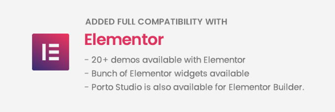
The Porto theme comes standard with the in my opinion very good WP Bakery Pagebuilder. A solid page builder that has several third-party plugins available to extend the elements. The theme is also fully compatible with the Elementor page builder, one of the best out there in this area. Among the demos you will find about twenty layouts that have been made with it, so that you can work with Elementor after you install one.
Click on the video above to see the page builder in action.
Porto theme review: Header builder
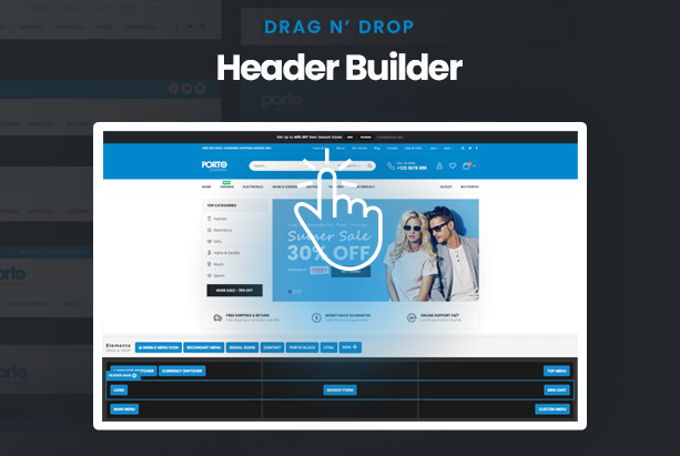
The header is like a grid where you can drag and drop elements. So it is easy even for laymen to build exactly the header they had in mind. A cool tool! We can't help but give the full marks for this in this Porto theme review.
Porto theme review: Elements
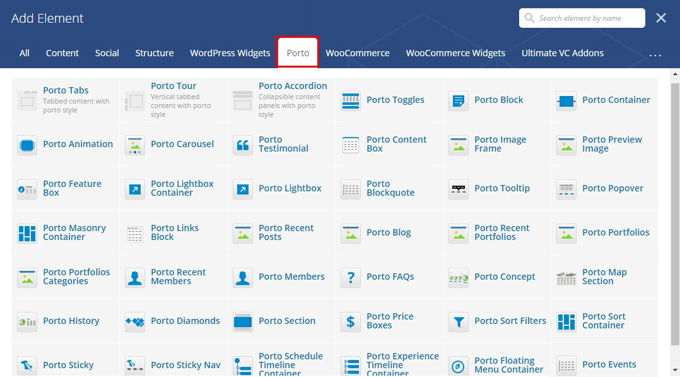
Porto currently offers 33 elements for the Bakery Pagebuilder, which, as mentioned before, is easy to expand with plugins.
Porto theme review: Revolution Slider
The Revolution Slider is by far the best slider plugin. There are a lot of options, which takes some getting used to if you do not know the plug-in yet and also after a major upgrade as has only happened with the new version 6. However, the documentation of the plug-in is very good, which means that you will quickly discover how everything works. Google searches also always help me with that. The good side is that once you get used to it, you don't want anything else. There are practically no limits to what it can do and everything works smoothly.
Porto theme review: Conclusion
I think the Porto theme is great. The demo layouts are beautiful, the setup of the theme is quick and easy, and it has a good loading time. The theme is indeed very suitable for building shops and the header builder is of course fantastic. The price is just standard for themes on Themeforest so that's okay too. The theme offers great value for money.
Porto vs Bridge conclusion
First of all, thank you for reading this Porto vs Bridge comparison to the end. A very good feature that both themes have is that they come with the great Elementor page builder. For example, upgrading to Elementor Pro is very easy if you use the full version of the best page builder out there. Both themes are very suitable for creating web shops, although I would rather use Porto than Bridge. Bridge offers a lot of beautiful demo designs to start your project. Porto has beautiful layouts for shops. As far as I am concerned, these themes are good to use if you only want to make 1 website with it.
In case you want to provide 2 or more websites with a theme, I do not recommend both of these themes because then it will be much too expensive, since a separate expensive license will be required for each website. In that case, you can much better use Astra or Divi as it will save you money for multiple sites. In addition, these latter themes are ranked higher in my top 10 themes for [2026] than Bridge and Porto.
Advertisement
