Avada vs Monstroid-2 review for [2026] 💥
AVADA vs MONSTROID-2
Avada vs Monstroid-2, which of these two top themes is best? Competition between the various theme builders is particularly high today. Some themes have already been sold 974,872+ times, we are talking about a million-dollar business. There are actually 2 strategies that maintain top themes.
Some themes are built to work very simply, to create a simple but perfect design, and to load as quickly as possible in a browser, a good example of this is the Astra Theme. Both Monstroid-2 and Avada belong to a category of themes where absolutely everything is possible and that everything is included so that in principle no plug-ins are needed anymore.
MONSTROID-2 THEME (monstroid-2 vs avada)
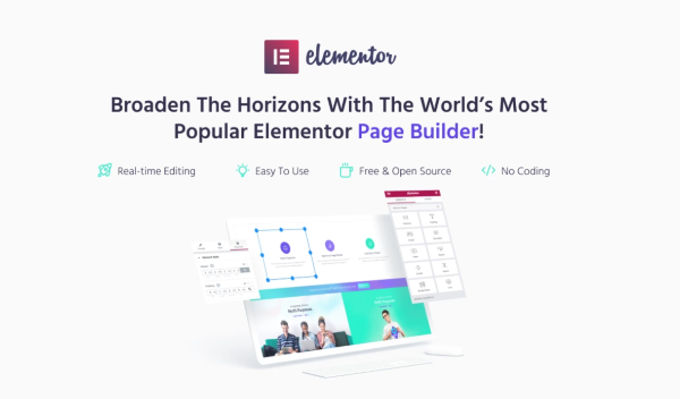
We will start in this Avada vs Monstroid-2 review with the Monstroid-2 Theme which does not automatically mean that it is better. Monstroid-2 is one of the top products on Templatemonster, a company that has been selling themes for more than 10 years and we are talking about thousands. The Monstroid-2 theme is standard equipped with the Elementor pagebuilder, one of the best page builders there are.
The Monstroid-2 theme has fantastic features and is therefore a top 10 WordPress theme anyway. It is made to work with Woocommerce which makes it ideal for e-commerce websites (shops). The code of the theme is also written in such a way that it loads very quickly in a browser. Nobody likes to wait long for something to be seen on a website, so that is a very valuable feature today.
Advertisement
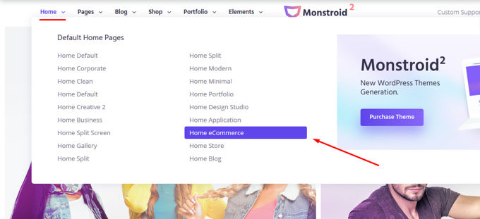
You can view many layouts for the theme from the main menu on their site. For webshops click on "Home E-commerce" (see photo below).
Monstroid-2 demo installation
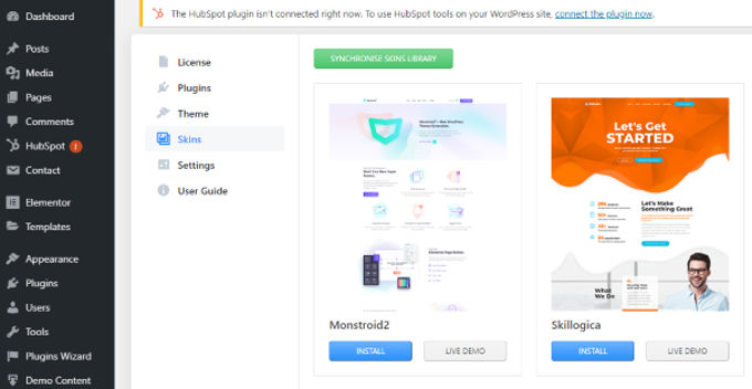
Installing the demos is easy via the back-end. Choose the desired design and start customizing it via the Elementor page builder. The figure below shows how simple it is.
Monstroid-2 shop lay-out
Monstroid-2 contains the new Jetwoobuilder that makes building product pages very easy. With the Jetwoobuilder you can create individual product pages from Elementor.
Below is an example of a shop layout that you can install in your Wordpress / Monstroid with 1 click. You do this via the import function of the theme. After that you only have to adjust the pages to your house style by replacing the demo material with your own photos and texts. The Elementor page builder will help you with this, it is a pleasure to work with this page builder. Everything is possible, works smoothly and is clear in terms of options.

Jet plug-ins in Elementor
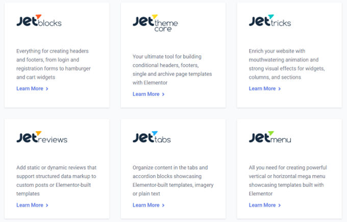
You get the popular Jet Plugins that you can use in Elementor for free. For example, Jet-Blocks allows you to create pop-ups, menus and more. Jet-Tricks provides animation and other effects. The Jet plug-ins and the integrated Elementor page builder are an enrichment of the theme.
Monstroid-2 vs Avada video
Watch a video below where Monstroid-2 is being compared with both Divi Theme and Avada. Like these 2 themes, the Divi theme is one of the best Wordpress themes out there and also the best-selling of all.
Below you can watch a video of what has improved in Monstroid-2, one of the best ecommerce and multipurpose themes for Wordpress, since the last major update.
Monstroid-2 conclusion
In this Monstroid-2 vs Avada review we will continue with Avada, so this is not yet a final conclusion. The Monstroid-2 theme is well worth the $ 75 required. Just for the quality of the theme and its demos, but we also have to take into account the Elementor page builder and Jet plugins that you get for free.
AVADA THEME (Avada vs Monstroid-2)
Welcome to the [2026] Avada Theme review, where we unravel the mystery behind its rockstar popularity. Picture this: Avada has been the chart-topping headliner in the Themeforest marketplace – a sort of 'Woodstock' for WordPress themes – for six straight years. With over 858,338 sales, it's practically the Elvis of themes, neck and neck with the Divi Theme.
But Avada isn’t just a one-hit-wonder. It boasts a rockstar rating of 4.78 out of 5 from a whopping 37,370 fans, I mean, users. This theme is like the Swiss Army knife of web design – multipurpose, adaptable, and ready for any gig, be it a webshop, corporate site, blog, or showcase. Think of it as your web design jukebox, playing any tune you want. Stick around as we dive into the top hits of Avada and explore how version 7.6 turned up the volume on this already amazing theme.
Advertisement
AVADA WEBSHOPS
Webshops are sprouting up on the internet faster than cat videos go viral. So, it's no shocker that Avada is all geared up and ready to build some shop-tastic sites. In the bustling world of online shopping, Woocommerce has become the go-to dance partner for both rookies and pros. And Avada? It's like Woocommerce's perfect prom date – compatible, charming, and plays well with all the popular Woocommerce plugins. It's like having a fairy godmother for your webshop, but with better tech support.

Imagine lining up your products in up to six columns on category pages – it's like having your own digital storefront window. While penning this Avada Theme review, I couldn't help but tip my hat to the smorgasbord of special Woocommerce options Avada brings to the table. We're talking product sliders and carousels that make your items look like they're on a fashion runway, quickview for the speedy shoppers, and search functions that could find a needle in a haystack. And this isn't just a happy accident; the Avada and Woocommerce teams are like peanut butter and jelly, working together in perfect harmony to bring you these snazzy features.
AVADA'S FUSION BUILDER
Avada claims their Fusion Builder is the best page builder in the galaxy, but hold your horses – let's add a pinch of reality here. Sure, Fusion Builder is a star, but it's not quite in the constellation of the top 3 page builders. Those spots are reserved for the likes of the Divi Builder, Elementor, and Thrive Architect. But hey, let's not dim Fusion Builder's shine – it's still a pretty nifty tool for crafting websites.
Imagine Fusion Builder as your friendly neighborhood drag-and-drop architect. It's got some cool tricks up its sleeve, like saving layouts to reuse on a rainy day. Need a button? A slider? An image? Titles? Fusion Builder’s got more than 60 different elements, ready to jazz up your site like a band at a Mardi Gras parade. And shortcodes? Throw them in the mix and watch the magic happen. It's like having a magic wand for your website's design!
AVADA'S FOOTER BUILDER
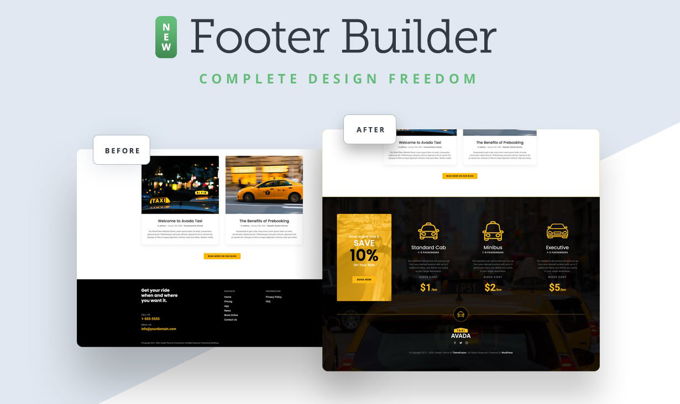
Avada's like the Willy Wonka of web design when it comes to crafting 404 pages, search pages, and the whole shebang of footers and headers. You get the golden ticket to design freedom – sprinkle your personal flavor on every page like a master chef seasoning a gourmet dish. Avada elevates these functions to a culinary art form compared to most themes. But just when you think you've seen it all, along comes Divi, strutting in like a gourmet critic, subtly reminding us that it still holds the Michelin star in this department.
AVADA'S DEMO IMPORTER
Think of Avada's demo importer as your website's fairy godmother. With just a click, it transforms a complete demo website into the starting blocks for your own web creation. Swap the logo, update the images, tweak the text, and voilà – you're halfway to having a website that screams 'you'. But let's be real, this is a party trick that all the top themes have up their sleeve.
Avada brings 66 complete website demos to the table, not to be mistaken for mere demo pages – that’s like comparing a full-course meal to a snack. While 66 might sound like a lot, Divi struts in with a whopping 120+. But hey, it's not just about numbers; both themes pack a punch in demo quality, like comparing two top chefs' signature dishes.

AVADA THEME REVIEW: SETTINGS
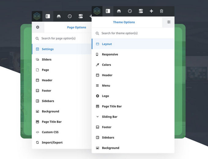
With Avada, managing settings is like sorting your socks – easy and straightforward. They've cleverly separated page settings from the whole website settings, making it a no-brainer even for beginners. It's like Avada's got a filing cabinet where everything's neatly labeled. And when it comes to completeness, Avada's settings are like a Swiss Army knife – they've thought of everything!
After years of tinkering and tweaking by their all-star team, it's no wonder everything in Avada clicks just right. Whether you're a seasoned web designer or just starting, navigating through Avada's settings is as smooth as scrolling through your favorite social media feed.
AVADA'S MEGAMENU
Who needs a separate plugin for a mega menu when you've got Avada? It's like having a secret weapon in your web design arsenal. Avada comes with one of the slickest mega menus out there for Wordpress – no extra shopping required. This mega menu is like a yoga instructor – super flexible.
You can tweak the height and width down to the pixel, orchestrate rows and columns like a conductor, or just go full width for that grandiose look. Want to add a bit of pizzazz? Pop in some icons or images next to your menu items. And the best part? You can have up to a six-column spread. It’s like setting up a buffet for your website visitors – everyone finds something they like!

AVADA'S SUPPORT
Imagine a superhero team dedicated just to supporting your Avada adventures – that's exactly what you get. Avada has a squad of 20 people, not just any folks, but ultra-professional, seasoned pros in the art of theme support. Need help? It's like having a hotline to web design wizards. You won't be twiddling your thumbs waiting for an answer; these support heroes are on the ball, ready to swoop in with solutions faster than you can say "web design dilemma."

AVADA: MY OPINION
Drumroll, please, for the grand finale of this Avada Theme review for [2026]! Avada is like the Swiss Army knife of themes – you dream it, and Avada builds it. It's so multifunctional, it could probably make a cup of coffee if you asked nicely. The theme builder? It's like a friendly butler, efficient and clear, guiding you through the web design mansion with ease.
Avada is perfect for rookies stepping into the web design ring for the first time, but it's also got enough muscle for the seasoned pros. Shortcomings? It's like looking for a needle in a haystack. Sure, an A-B test tool and pop-ups like its cousin Divi might be the cherry on top, but let's be honest – Avada's already a pretty sweet deal without them.
AVADA PRICING
Pricing up the Avada theme at $60? Sounds like a deal. But here’s a twist – throw in an extra $30, and you can snag the Divi Theme, the James Bond of themes. While Avada gives you a license for one website, Divi is like an all-you-can-eat buffet – use it on as many sites as your heart desires.
And speaking of alternatives, let's talk about the world's best-selling theme, Divi. It's like comparing a luxury car to a reliable sedan. For a bit more cash, Divi doesn't just give you a theme; it's like a golden ticket to a theme park, with 86 other premium themes and a bunch of fancy plugins. Opt for the lifetime support at $249, and it's like having a web design butler for life. And hey, if you're humming and hawing, take a gander at our Divi Theme or waltz over to the real Divi website to see the glitz and glamour for yourself.
Monstroid-2 vs Avada: Review final conclusion
We will now complete this Avada vs Monstroid-2 review. My personal conclusion is that both themes are suitable for any kind of website. Specialty in Avada are the many settings, options and design where Monstroid-2 excels in faster loading time and better page builder. I use both themes myself and prefer to work with Monstroid-2 rather than Avada, but that is a personal preference. You decide .. both themes are more than worth their money.
Recommended
Using a CDN significantly reduces the loading time of your website, especially if the visitor is not near where your website is hosted. The best CDN is Stackpath, your website will load super fast anywhere in the world. Stackpath will also build a security network or Firewall between your website and its visitors, so your website can practically never be hacked. Also Stackpath has quality optimization options that you will not get on that standard on your own server.
Advertisement
