Flatsome vs Woodmart Theme comparison [2025] 💥
Flatsome Theme (Woodmart vs Flatsome)
When it comes to e-commerce, Flatsome stands out for its stellar features and seamless functionality. With an outstanding rating of 4.80 from over 5,500 users, this theme is a top pick for many online stores, boasting more than 206,000 downloads.
Advertisement
Flatsome launched in 2013, making it a seasoned theme that's refined with each update. This longevity has built a reliable e-commerce theme that's packed with great features and will likely stick around for years to come.
Flatsome and WooCommerce
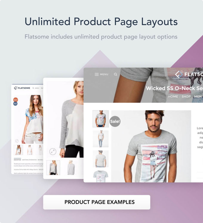
As an e-commerce powerhouse, Flatsome integrates seamlessly with WooCommerce. Each product page is customizable to suit your style, and checkout pages can be tweaked with ease directly in the CMS.
With wishlist features, sticky headers, live product search, and unlimited customizable forms, Flatsome offers a fully immersive shopping experience that doesn’t compromise on ease of use. These features make it easy for customers to engage with the store, search for products efficiently, and save items for later – all key elements for driving conversions.
Headers in Flatsome
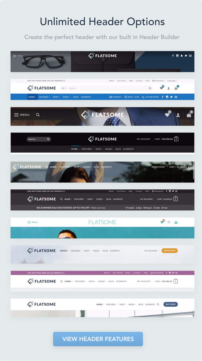
The Flatsome header builder is both intuitive and versatile, allowing users to personalize their store's header design effortlessly. You can choose from various styles, colors, and layouts, crafting a header that aligns with your brand’s identity. Adjusting the header is simple, giving you complete creative freedom to create a visually engaging and functional navigation area for your store.
UX Builder
The Flatsome UX Builder is designed with ease of use in mind, making page building a seamless process for beginners and seasoned users alike. Its drag-and-drop functionality enables you to create pages without needing coding skills, allowing you to focus on visual and interactive elements. While it may not boast every feature of some premium page builders, it provides ample functionality for most e-commerce needs and keeps the design process efficient.
SEO Optimization
Flatsome stands out with excellent performance, particularly in loading speed and SEO-friendly structure. Its clean code and optimized design contribute to faster page load times, which is critical for search engine rankings. Faster sites typically rank higher, and Flatsome's focus on keeping pages lightweight without sacrificing visual appeal makes it a strong choice for SEO-conscious store owners.
Final Thoughts on Flatsome
Flatsome is a superb choice for e-commerce stores looking for a blend of high functionality and ease of use, complete with engaging visuals and streamlined management features. Its dedicated e-commerce tools make it ideal for businesses focused on online sales. However, if you're looking for a more versatile theme suited to various website types, Divi is also a fantastic alternative for almost any style of website, from portfolios to corporate sites.
Woodmart Theme (Woodmart vs Flatsome)
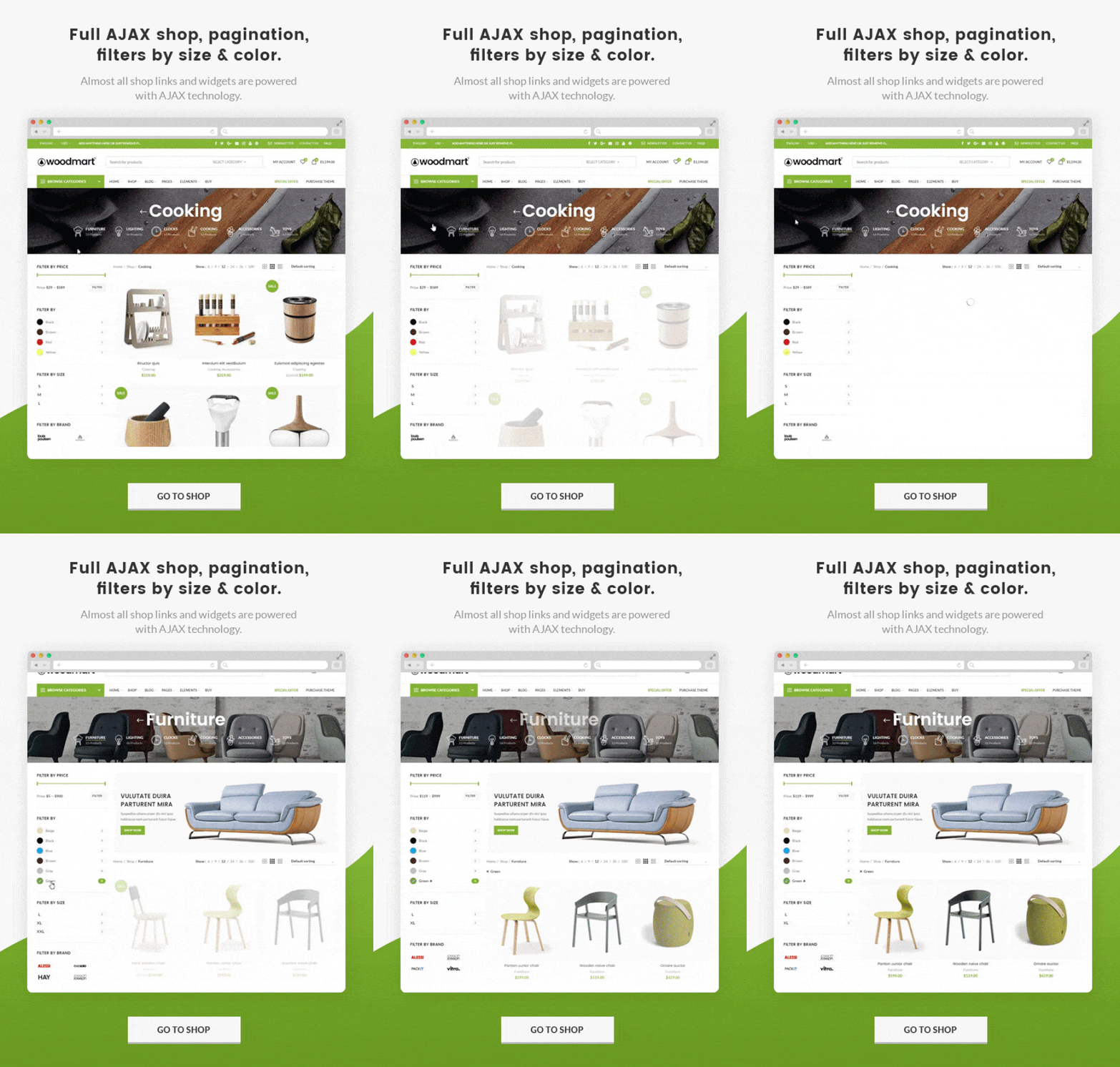
Woodmart is a highly-rated WooCommerce theme known for its versatility and easy integration with the Elementor page builder, allowing you to craft stunning shops with minimal effort. With a near-perfect rating on Themeforest, Woodmart's popularity speaks volumes.
Woodmart's Demo Library
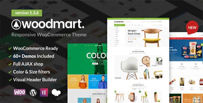
Woodmart comes packed with 60+ demos, tailored for niches like fashion, electronics, and furniture. These demos make it simple to set up a unique store in minutes.
Header Builder
Woodmart’s header builder offers a diverse range of styles, giving you the flexibility to craft a header that aligns perfectly with your brand. Whether you prefer a minimalist approach or something more elaborate, Woodmart provides options that cater to any aesthetic. With customizable layouts, colors, and elements, you can create a unique and engaging header that enhances user navigation and boosts brand recognition.
Mega Menu and Quick Shopping
Woodmart includes a polished built-in mega menu, ideal for stores with extensive product categories. This feature enhances user navigation by organizing categories and products in a visually appealing way, reducing friction for customers. Additionally, the quick shopping feature streamlines the shopping experience, enabling users to quickly view product details and add items to their cart. Together, these tools help optimize conversions and improve overall customer satisfaction.
Final Thoughts on Woodmart
Woodmart is a solid choice for single-site e-commerce projects, offering an impressive array of features designed to enhance the shopping experience. However, for users managing multiple sites, it may be worth exploring themes with more flexible licensing options, such as Astra or Divi, which provide broader usage at a lower overall cost per site.
Rating Features with Stars ⭐
| Feature | Flatsome | Woodmart |
|---|---|---|
| Page Builder | UX Builder | Elementor |
| Header Builder | ⭐⭐⭐⭐⭐ | ⭐⭐⭐⭐⭐ |
| WooCommerce Integration | ⭐⭐⭐⭐⭐ | ⭐⭐⭐⭐⭐ |
| Speed Optimization | ⭐⭐⭐⭐ | ⭐⭐⭐⭐ |
| SEO-Friendly | ⭐⭐⭐⭐⭐ | ⭐⭐⭐⭐ |
FAQs
1. Which theme is better for a WooCommerce store?
Both themes are well-suited for WooCommerce, but Flatsome may be better optimized for larger stores due to its advanced features.
2. Can I use these themes for multiple websites?
Both require separate licenses for each site. For multi-site use, Divi or Astra may be more economical.
3. Do Flatsome and Woodmart support Elementor?
Woodmart fully integrates with Elementor, while Flatsome uses its proprietary UX Builder.
4. Are there discounts for either theme?
Both themes are sold on Themeforest, which typically doesn’t offer bulk discounts.
5. Which theme is easier for beginners?
Both themes are beginner-friendly. However, Woodmart’s Elementor support may offer an easier learning curve.
Advertisement
