Enhancing Visual Appeal: Incorporating Shape Dividers in WordPress [2026] 💥

Website design is a dynamic realm that constantly seeks innovation, aiming to capture the attention of visitors with elegant transitions and appealing aesthetics. One of the most recent trends in design is the use of shape dividers to create fluidity and interest between sections of content. But how can one easily integrate such a feature into a WordPress site?
Advertisement
Enter the Divi theme. A stellar solution to the challenge at hand, Divi brings to the table its Shape Dividers, granting users the capability to infuse unique shapes and effects into their pages. This innovation not only provides dynamic transitions between content blocks but also adds a personal touch to your digital presence.
The Magic of Shape Dividers in Divi
Shape Dividers, as introduced in Divi, revolutionizes the way we perceive the transition between content sections. They can be conveniently positioned both above and below each section of your website. This flexibility ensures that stunning transition effects can be achieved, regardless of where your content is placed on the page.
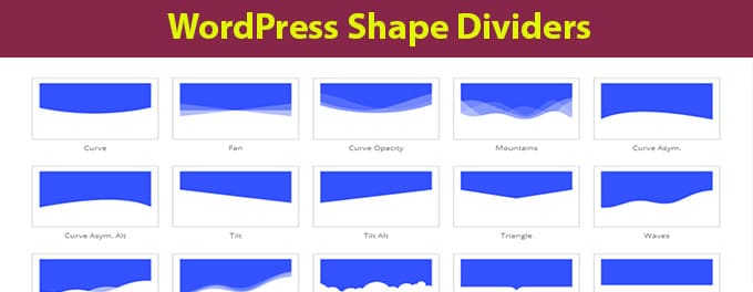
What makes Divi’s Shape Dividers even more intriguing is the variety. With a whopping 26 distinct shapes available, the possibilities for design are vast. Each shape has been crafted using SVGs, ensuring they retain their quality across different resolutions and screen types, including retina devices. Additionally, the SVG nature of these shapes ensures they remain lightweight, preserving your website's loading speeds.
Customizing Shape Dividers in Divi
Now, you might wonder about the level of customization available. The Shape Dividers in Divi come equipped with an intuitive interface within the Visual Builder. This interface lets users effortlessly add and tweak shapes, observing the transformation in real-time. Whether it's size, rotation, arrangement, or color, every aspect is customizable.
The flexibility doesn't end there. Every shape can be resized based on both pixel and percentage units, allowing for precise design control. For those looking to stand out, shapes can be repeated to form unique patterns, with each repeated shape taking on a whole new identity.
Layering for Stunning Visual Effects
The use of Shape Dividers doesn’t confine you to placing them strictly above or below content. By positioning shapes either on top of your content or underneath it, users can concoct unique visual effects. This creative layering, especially when paired with text and images, can lead to some captivating results.
Effortless Color Integration with Divi’s Shape Dividers
One might presume that with such intricate designs, color matching might become a chore. However, Divi's Shape Dividers shine here as well. Thanks to the automatic color inheritance feature, any new divider shape added will inherently adopt the color of the current section as well as the adjacent one. This ensures a fluid transition between sections without necessitating manual color customization. Moreover, if you happen to adjust the section’s background colors or move it, the divider color updates seamlessly.
Conclusion
WordPress website design has been elevated to new horizons with Divi’s introduction of Shape Dividers. Whether you're a seasoned designer or someone taking their first steps in website creation, this feature promises ease of use, customization, and visually captivating results. As the digital landscape gets more competitive, such tools become indispensable for anyone looking to make a lasting impression. For a more comprehensive look into what Divi offers, check out our Divi Theme Review.
Advertisement
