Elementor vs Gutenberg pagebuilders [2026] 💥
ELEMENTOR REVIEW (Elementor vs Gutenberg)
Elementor is now more than just one of the best page builders...
Ever played with LEGOs? That's pretty much what it's like using Elementor page builder - except you won't step on any pieces! It's like the Swiss Army knife of page builders, fitting into any theme like a charm. And guess what? Elementor has its own theme buddy, The Hello theme, which is as free as your grandma's love!
With over 300 ready-made demos, it's like having a party where all your favorite themes are invited. Who needs other themes when you've got Elementor? It's like saying you need another pizza topping when you've already got pepperoni. The Hello theme is like that one friend who always has your back - reliable, sturdy, and doesn't ask for much.
Advertisement
Imagine a superhero that swoops in to save your website design - that's Elementor for you! Fresh out of the web oven in 2016, and already it's like the popular kid in school, hanging out on over 8 million sites. Elementor isn't just any page builder; it's like the secret sauce that makes your web design as easy as making instant noodles – quick, easy, and surprisingly good!
ELEMENTOR PAGEBUILDER REVIEW: THE WEB WIZARD
Ready for a sneak peek? Check out the clip below. It's like watching a cooking show, but for websites. You'll get a glimpse of the magic behind the curtain, showing you how to whip up a web masterpiece with Elementor. For the full magical recipe, click here and dive into the world of Elementor's Editor.
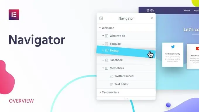
ELEMENTOR NAVIGATOR
Ever wished for a genie in your worksheet? Meet the brand new tool that's like your personal design assistant! It's versatile - dock it on the right or let it float like a happy little cloud in your worksheet. Just give any element or block a right-click and say 'Abracadabra'... Okay, just select "Navigator" to open it. This nifty Navigator turns work into play and speeds things up like a sports car on the autobahn. Intrigued? Watch this video for a magic show about the Navigator.
ELEMENTOR SAVE WORK
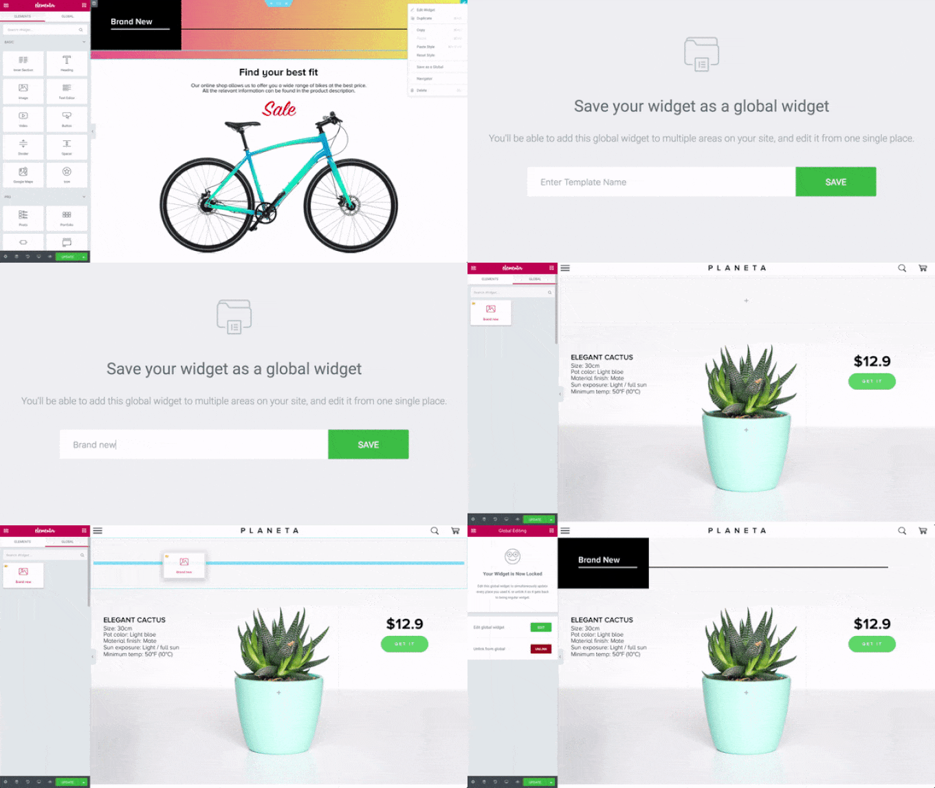
Who enjoys repeating the same task more than watching paint dry? Not many! Elementor is like a time-travel machine for your work. Save your work blocks, and poof! Reuse them on other pages, posts, or even teleport them to other websites. It's like having a "copy-paste" superpower for web design. This means you can say goodbye to the old-school, time-consuming methods. Want a sneak peek? The animation below is like a mini trailer of this awesome feature!
READY-TO-USE DEMO DESIGNS

Like its cool cousin Divi, Elementor boasts a wardrobe of over 200+ layouts for every niche under the sun. Corporate, web shops, hotels, gyms, cafes, fashion, hosting, photography, architecture, lifestyle, travel - you name it! Plus, there's a squad of third-party designers crafting gorgeous layouts for Elementor, giving you even more options. Opting for these may add a little to your tab, but hey, who doesn't love a bit of extra sparkle? Check out the entire layout library here and get ready to be dazzled.
ELEMENTOR WOOCOMMERCE BUILDER

Elementor is like the fairy godmother for webshops, turning your site into a Cinderella story. Just like most top-notch themes, it's perfect for dolling up your online store. Imagine creating chic product pages and stylish category pages for Woocommerce, all without needing to be a wizard in HTML.
Yep, those days of needing coding spells are long gone! You're probably familiar with Woocommerce, the most popular shopping cart charm for Wordpress. Get ready to be wowed and check out this video for a magic carpet ride through the world of Woocommerce Builder with Elementor. Watch here for more enchanting details.
ELEMENTOR REVISIONS EDITOR

Elementor, like a tech-savvy superhero, wasn't too thrilled with the standard-issue revision editor in Wordpress. So, what did it do? It rolled up its digital sleeves and whipped up its own souped-up version. And let's be honest, the default Wordpress editor for revisions was as fun as watching paint dry – not cool when you needed to roll back changes.
It's not alone in this quest for greatness, as both Divi and Thrive are also packing this tool. Curious to see Elementor's Revisions Editor in action? Watch this video and dive into the world of smoother, smarter revisions!
ELEMENTOR REVIEW: MOBILE EDITING

Elementor's like a tech-chameleon, seamlessly adapting to mobile, tablet, and desktop. As seen in the wizardry above, it's got "out-of-the-box" responsiveness, but here's the kicker – you get to tweak and tailor specifically for each device! It's like having a magic wand to perfect your site's look on any gadget.
And sure, this might be a common trick among top themes and page builders, but it's always cool to have that extra control in your toolbox. Fancy seeing this magic in motion? Watch this video to dive into the realm of Elementor's Mobile Editing – it's like having a mini tech genie at your fingertips!
ELEMENTOR COLORS
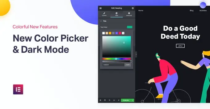
In our Elementor review, we're tipping our hats off to its color editor for texts, which is like a mini Photoshop tucked inside your website. Elementor brags about its "pixel perfect design," and honestly, they have every right to. It's like having a rainbow at your fingertips – every color imaginable, plus the power to create mesmerizing gradients.
It's like being a digital artist without the mess of paint! Ready to add some color to your site? Watch this video and get the lowdown on Elementor's Color Picker – it's like the digital version of a paint palette!
ELEMENTOR HEADER & FOOTER

Elementor gives you the keys to the kingdom when it comes to headers and footers – total control, just like a web design royalty! Sure, all the elite page builders have this feature, but it's like having a secret weapon in your theme arsenal. Imagine crafting headers and footers that are the crown jewels of your site. Want to see how it's done? Watch this video for a royal tour of Elementor's Header-Footer Builder – it's like being the architect of your own digital castle!
ELEMENTOR BASIC ELEMENTS

ELEMENTOR PRO ELEMENTS

ELEMENTOR THEME ELEMENTS

Think of Elementor's elements as the building blocks of your web page castle, and boy, does Elementor bring a whole toy box full of them! It's like they've thought of everything, leaving no stone unturned. And here's a fun surprise – Elementor comes with its own pop-ups, stylish and user-friendly, so you can bid farewell to your old pop-up plugin.
It's yesterday's news! You won't need it anymore. Curious about the full array of tricks? Check out this link for a grand tour of all 90+ Elementor Widgets – it's like a theme park for web designers!
ELEMENTOR POP-UPS

Elementor's pop-ups are not just beautiful, they're like a piece of cake to set up – a delightful tool indeed. In the world of top page builders, it's like they're all peeking into each other's notebooks, copying the best notes. These pop-ups are the MVPs for your call-to-action and conversion plays. Ready to add some zing to your site? Check out this link for everything you need to know about Elementor's pop-ups – it's like unlocking a secret weapon for your website's engagement!
ELEMENTOR REVIEW: PRICING

Curious about the price tag for this web design magician called Elementor? Peek at the image above for the grand reveal. When it comes to value for money, Elementor is like finding a designer gown at thrift store prices – it's worth triple what you pay, especially when you stack it up against premium themes that ask for more but give you less. It's like getting a five-star meal at a fast-food price! Intrigued? Hop over to the pricing page and keep your eyes peeled for discounts. It's like a treasure hunt for deals!
ELEMENTOR ACADEMY

Got a few lingering questions about Elementor? Don't fret! You might just find the answers you seek in the super-organized, almost magical Elementor Academy. It's like the Hogwarts for web design, brimming with wisdom and answers to all your Elementor mysteries!
GUTENBERG (Elementor vs Gutenberg)
In this Elementor vs Gutenberg comparison we now continue with Gutenberg which is not an easy task as there is little good to report. When Gutenberg was just out, I was shocked. Where was the Wordpress editor? It is then thought to be an improvement and is trying to work with it. I quickly found out it was the biggest mess possible. What a disappointment. In this Gutenberg Wordpress editor review for [2026] we look at whether more people are not happy with this and what the future holds.
Gutenberg editor Ratings
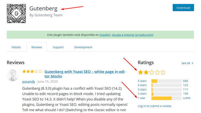
For starters, on the plugin page itself, let's see what the ratings are for it.
An average rating of 2 stars. Of the approximately 3000 people who gave a rating, 2100 gave the minimum number of 1 star, if they could have rated 0, they probably would have. On the other hand, there were 600 people that gave a 5 star rating. I had to think how this is possible, but you know the internet as well as I do and it is customary to always give the maximum 5 stars even if you are not so happy to please the builders of something. In this Gutenberg review, we therefore note that the majority of people think it is a rubbish heap, just like me.
Disable Gutenberg
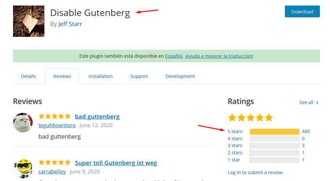
To get rid of the terrible Gutenberg editor, there are several plugins. We take a closer look at 2, the first is "Disable Gutenberg".
Above, it can be seen that out of the practically 500 people who rated this plugin that has been installed over 5 million times, all but 4 gave it all 5 stars, so glad they got rid of Gutenberg for good.
Classic Wordpress editor
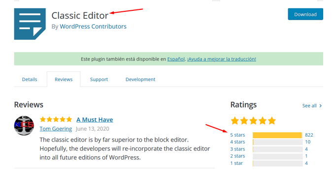
The "Classic Editor" plugin is from Wordpress itself and will be there at least until 2024 as they apparently know for themselves that Gutenberg is no good. Apparently they think they can make something of it in a year or two. The problem will be that practically everyone has hated it by then. Well, millions of people use this plugin and its ratings can be found below.
The editor itself
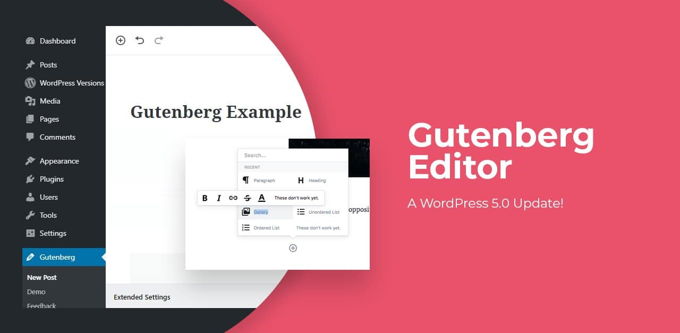
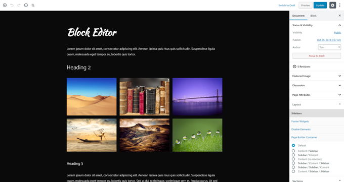
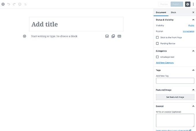
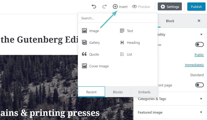
On paper, Gutenberg is a WYSIWIG front-end page builder. When you use the word page builder you probably think of a Divi-like experience but forget it quickly. Gutenberg is very slow (too much Javascript) and works very clumsy. The image below gives an image of what you will be presented in the back-end and front-end, you have to do with that. The only thing that can be considered positive is that when you "paste" a large text with titles and blocks of text, the editor itself divides everything into blocks. I say positive, but some people may prefer to take control of it themselves, so it can be very annoying.
Gutenberg back-end view
Gutenberg front-end view
Gutenberg with certain themes
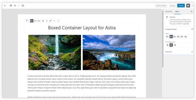
In combination with good themes like Astra or Generatepress is the worksheet a bit more attractive as shown in the pictures below. Despite that, there is still no comparison with really good editors out there today like Divi, Elementor and Thrive.
Gutenberg + Generatepress
Gutenberg + Astra
Gutenberg guinea pigs
In principle, we as Wordpress users are used to test the Gutenberg editor until after a year or 4 it can finally be used properly. Obviously this is concealed, it is pretended to be a fantastic improvement in Wordpress. Otherwise everyone would immediately disapprove of the editor, which is already the case with the ratings. People are not crazy, of course.
I will not go into all the small details, Gutenberg is completely BETA and should first be tested well for a few years without being in Wordpress. Furthermore, there is a lot missing in the editor, it is confusing, slow and not precise.
My advice regarding Elementor vs Gutenberg
First of all, thank you for reading my Elementor vs Gutenberg review to the end. My advice is simple. Don't work with Gutenberg to avoid disappointments and mistakes. At the very least, immediately install one of the 2 plugins discussed above that will make Gutenberg disappear and restore the old familiar Wordpress editor.
If you are willing to incur some cost to work with a good editor, it is best to purchase the Elementor pagebuilder or the Divi Theme, with the Divi Builder (pagebuilder) already in it. These two page builders are the cream of the crop in this area and you won't regret it.
Advertisement


